Project Description
Learner Onboarding Redesign
Redesign of Anki Mobile, a flashcard app for making things easier to remember.

Overview
ABOUT
Anki Mobile is a mobile version of a desktop flashcard app that utilizes spaced repetition to help with remembering words or phrases and their translations. Among different flashcard apps, Anki Mobile has a unique group of users, in which the majority are very invested in language learning and are already familiar with Anki on desktop. For this project, I’ve redesigned the onboarding experience for Anki, along with the app’s most important functionality.
SCOPE
Product Design
User Research
Prototyping
Visual Design
YEAR
2020
Problem
Compared with its alternatives, Anki’s user experience is unfriendly to the new users, who have a hard time understanding how to use the app. Anki’s interface is outdated and unintuitive. To browse collections to study, a user has to manually go to a separate website, resulting in a cumbersome experience, discouraging new learners.
Research
INTERVIEWS
Anki’s basic usability issues are easy to pinpoint with heuristic evaluation, however, I decided to do more research to better understand how new users are using the app and what are their frustrations. I conducted interviews and read the app reviews, summarizing the qualitative data by affinity mapping, which allowed me to conclude the most significant usability problems:
- It’s hard to understand how to use the app
- It takes too much time to study with flashcards
- There is no clear way to track the progress
- It’s hard to create personal deck collections
- The interface design is not up to date with the current standards
APPROACH
Based on the research, I was able to understand the major problems within the app and set the scope on rethinking the onboarding experience for fresh learners, as well as, redesigning the important functionality within the app:
- Browsing and saving deck collections
- Creating own decks
- Study sessions
- Checking progress


Wireframes
I started by creating low fidelity wireframes to map out the content while rethinking the processes necessary to accomplish a specific action. My goal for this part was to simplify the user flows and make the app more intuitive by designing the interface to resemble real flashcards. Flashcard elements are present in most parts of the app to create a consistent language.

Signing Up
The current Anki app opens the dashboard right away after opening the app for the first time. While that might be efficient for experienced Anki users, new learners are left without any clue on how to use the app. Redesigned signing up process guides new users, allowing them to specify their learning interest and letting them find their first collection to study.


Browsing Collections
Previously, to browse the card collections, the user was redirected to a website, making it really hard to navigate between the browser and the app to save the collection. The new app allows browsing collections directly in the app, which are visually recognizable with a cover image.


Creating Collections
Creating collections is easier with an interface that resembles physical flashcards, allowing the user to flip the card and add content on both sides.


Study Session
Redesigned study sessions have a progress bar in addition to the number of new, learning, and reviewing cards. Visually, it makes it easier to track lesson progress. Progress bars also have been added to the collection page, where the user can check the overall progress and progress for each lesson.


Checking Progress
The previous version had an extensive set of charts with data to let the user track the progress. The charts are hard to understand and at times they feel unnecessary. Redesigned display of data has been simplified and translated to a system of levels and achievements to encourage users to continue their progress.

Outcomes
The visual prototype was produced as a proposal for the redesign of Anki Mobile. It’s currently in the process of being iterated upon, focusing on building interactions.
Next Project
Next Project
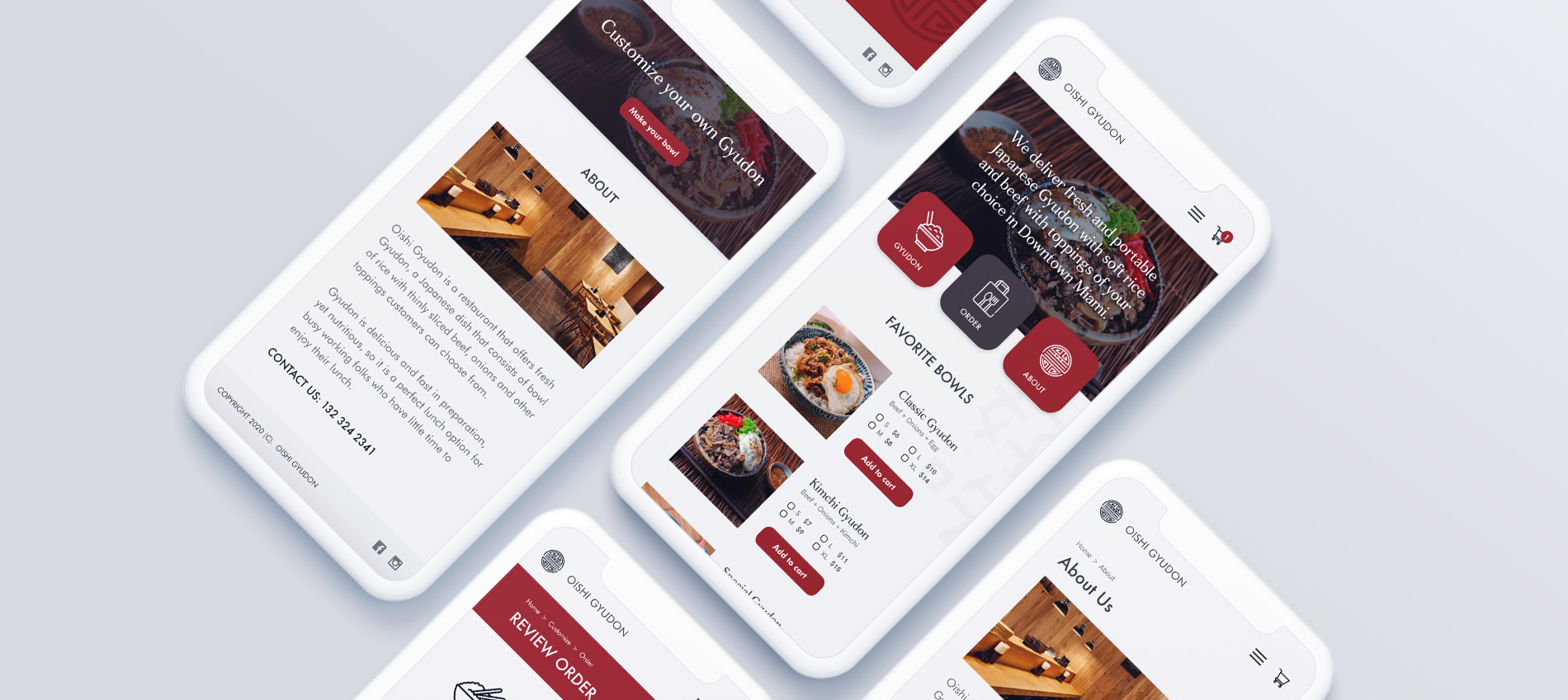
Gyudon Restaurant Website